Use texture when decorating
By Hasan Nour Al-Dine
Texture is the feel of any surface, the surface quality of any material. Texture is a key element that should be taken into consideration while designing or renovating any space. Unfortunately, this element has been forgotten by most designers.
Texture has the ability to add depth to any room, making it alive and more powerful. With different textures we can determine how a space will feel like. It is the magical ingredient that can make an interior space pop, and should not be overlooked when designing a new interior scheme.
There are two kinds of textures: Tactile and Visual. Tactile texture is not only visible to the eye, but can be felt with the hand. Tactile texture rises above the surface of a two-dimensional design, and approaches a three-dimensional relief. This kind of texture has an impressive impact when exposed to light. However, visual texture is the illusion of surface’s texture. It is the tactile texture on a 2D surface. Let’s take as an example a texture we see in photographs; no matter how rough objects in the photograph look, the surface of the photograph is smooth and flat.

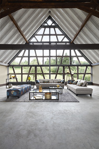
Natuzzi
Applications of texture:
While applying textures, there are key factors that we need to take care of:
- Contrast: Contrast is essential when it comes to textures as it provides visual interest. To create contrast, you can use materials with completely different surfaces, like combining rough stones with wood panels, glass and fabric. If everything looks too similar, our eyes have trouble focusing and tend to glaze over. Use texture to make sure the most important elements pop.

Roche Bobois
- Balance: It is important to understand that every element in any room has a texture, whether soft or rough. Do not go crazy with applying too many textures. We have to know that a rough texture makes the object look and feel heavier, and smooth textures make an object feel lighter. So, while balancing textures you should take into consideration the scale of every piece. For example, use a rough texture on an armchair and soft fabric on a big sofa. If you do the opposite and apply the rough fabric on the big sofa, the room will look heavier
Roche Bobois
- Monochromatic scheme: If you are working within a particular group of color (monochromatic / analogous) where shades are very similar, make sure to use textures that are greatly contrasting. Together they will bring a sense of harmony.
Natuzzi
- Light: Every texture reflects light in a different way. Heavy textures absorb light, making the room feel smaller and cozier. However, soft textures reflect light and make the space look bigger and more exciting. Use shiny reflective textures where more light is needed and darker, more absorbent textures where the light level is too high.
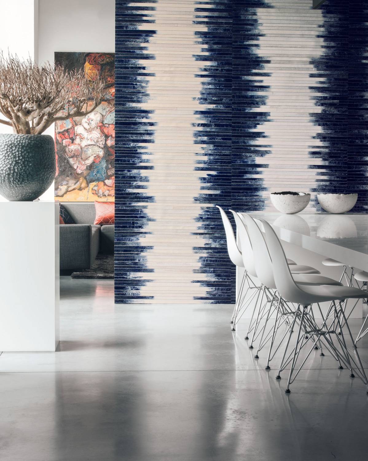
Casamance, find it in Tivoli