Colors
By Hasan Nour Al-Dine
“Let me, Oh let me bathe my soul in colors; let me swallow the sunset and drink the rainbow.” Kahlil Gibran
Color is one of the most challenging aspects of styling any space. Color is an extremely subjective topic, as each of us has his/her own favorite colors, which influence our feelings and perceptions. Color also has a unique connection to our mood and emotions.
Color lies under three categories: Primary, secondary and tertiary. Primary colors are: red, blue and yellow RBY. Secondary colors are a combination of any two primary colors. Blue with red give us purple, blue and yellow generate green. Moreover, tertiary colors are a mixture of primary and secondary colors, green with yellow generate yellowish green.
Color Temperature
The scientific definition of color temperature is the temperature of a light source, measured in Kelvin. Color is divided in two categories as per its temperature: warm and cold.
Warm colors like reds, oranges and yellows tend to have lower temperatures. Referring to sun and heat, warm colors are energetic and tend to awaken and stimulate a space. Yet, they make big spaces seem smaller and cozier.
However, cold colors like blues and greens, tend to have higher temperatures. Referring to the wide sky, sea and landscape, cool colors are calming and create a soothing impression. They make small spaces feel bigger and more refreshing.
Neutral colors such as whites and grays also have a range of temperatures: warm grays tend towards brown and cool grays tend towards blue.
Color Schemes
Before any further discussion about color meaning, we must first understand the concept of the color scheme, and the different methods of choosing an interior color palette.
When color is not tied to a material, there are six assorted color combinations available:
- Monochromatic: is choosing a single color in different degrees of saturation and lightness to unify a scheme. While working with this scheme, we must think about making contrast. Contrast is a top priority. It is an easy scheme to work with, as the hues balance themselves, and it is easy to manage and place furniture.

- Analogous: placing colors that are directly adjacent to a chosen color on the color wheel. For example, pairing red with red violet and violet. The key element that should be taken into consideration while working within this scheme is proportion. Following 60 – 30 – 10 rule is recommended! The dominant color should take over 60% of the space, 30 % by a balancing color and 10% as an accent color.
- Complementary: is when pairing the chosen color with its opposite on the color wheel. For example, pairing red with green. This scheme is the simplest scheme. It provides sharp contrast. 1 color to be used as a dominant color, however the second is used as an accent color. It is recommended to use neutral colors to make the space more appealing and balanced.

- Split Complementary: is when pairing the chosen color with two adjacent opposite colors on the color wheel. For example, pairing red with different shades of green and blue. This scheme is safer than complementary as it provides more colors and the opposite colors make the balance without the need for neutrals. It is better to use a muted color as dominant.

- Triadic: is when using colors that are equally spaced around the color wheel. For example, combining red with yellow and blue. The triadic scheme provides sharp contrast while maintaining harmony. It is recommended to use two muted colors to avoid intensity.

- Tetradic: is when using two complementary color pairs on the color wheel. For example, complementing different shades of red-orange and red-violet with blue-green and yellow-green. This is the hardest scheme to balance as it provides lots of color variety. It is recommended to use 2 colors as dominants and 2 to balance. Avoid using pure, fully saturated colors in equal amounts.

Power of the Opposites: B&W
White gives the impression of purity and affords a quiet atmosphere. It’s considered to be the shade of perfection. White gives the impression of safety, cleanliness and good hygiene. It reflects light, which makes any space seem bigger. It’s the perfect shade for interiors in hot areas such as the GCC and the Middle East, as it proffers a refreshing experience.
However, black is the strongest shade of all and can be matched with any color. Of course, it’s never used to cover walls, as it’s not a reflective color and can really bring a person’s mood down as it’s quite suffocating; unless it is used to cover cinema room’ walls. It absorbs light and makes rooms feel smaller. However, its power comes to life when it’s matched with white.
Together, black and white create a core ageless combination, which is always trés chic! To create a dramatic effect, use B&W in geometric patterns. Keep walls white and use black leather furniture, checkerboard flooring, (a black and white striped accent wall is very attractive in small doses) and B&W striped furniture to create outstanding effects. Accessorize this contrast with accents of gold or silver and a very dynamic and palatial interior takes shape. Black and white are both neutral colors, so it’s easy to blend them with beautiful colorful graphics, figures or a simple strong block of plain color to contrast and highlight.
Tip Top: While choosing colors, combine glossy and matte finishes for a subtle textured effect. This gives more depth to space.
The Beauty of Pastel Shades
A color is considered pastel when it’s high in lightness and low-to-medium in saturation. Pastel colors have the ability to create a soft, gentle and relaxing environment. Moreover, when paired with bright or bold colors, they project impact.
Symbolizing the blooming flowers in spring, pastel colors evoke feelings of happiness, innocence, optimism, and delight.

Psychology of Colors
To create a more unique and unusual style, understanding what each color symbolizes is useful.
Blue: It is the most favorable color in the world. A welcoming, very soothing color that reflects openness, tranquility, and calmness. Best to pair it with white or lighter hues. Good to be used in living rooms and entrance areas, as a welcoming atmosphere. Also, it is good to be used in bedrooms and rooms that are intended to relax.
Green: It is the most used colors. Green reflects rejuvenation, good health, peace, balance, harmony, wellbeing and more. It encourages mental relaxation. Green color provokes us into regaining our lost connection with Mother Nature. Use this color on painted walls, on wallpaper that presents the idea of green landscapes or simply add real plants to your space to make it feel safe, alive and natural. A light apple green is a favorable choice as it blends the freshness of white with the calming aspect of green in one hue. Best to use it in bedrooms, and living areas.
Yellow: It is a controversial color! Yellow should be carefully placed within a color scheme. It is a cheerful color that reflects happiness, optimism and uplifts confidence. It is very energetic and exciting color. However, misusing yellow may reflect negatively on the inhabitants, as it can annoy and cause eye fatigue if used in too large an area and too bright a shade. Best to pair it with white, green, blue and lilac. It is best to be used in hallways and areas that lack windows.
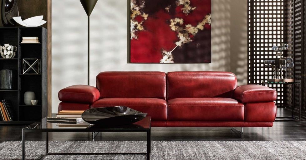
Red: It is the color that draws the attention the most. It symbolizes love, intimacy, passion, strength, and power. On the other hand, it reflects blood, war, and danger. It was proven that red color increases heartbeats. Red should be carefully used in any space. Since it increases the appetite, it is recommended to use it in dining areas. One of the features of red is that it flatters the skin, thus it’s a great color for make-up rooms.
Orange: It is the warmest color. It combines the excitement of red and the friendly aspect of yellow. It encourages activity and stimulates conservation. Best to use it in the home office or studying areas, playing rooms as it increases productivity and boosts energy. A warm apricot orange shade is very useful in the entrance areas of a welcoming color. Since orange increases appetite, it is great to be used in kitchens and dining rooms.