9 tips on how to use Living Coral, colour of the year 2019
By Cayetana Moret
Vibrant, yet mellow Living Coral embraces with warmth to be introduced into any space.
An animating and life-affirming coral hue with a golden undertone that energizes and enlivens with a softer edge
Sociable and spirited, the engaging nature of Living Coral welcomes and encourages light-hearted activity. Symbolizing our innate need for optimism and joyful pursuits, Living Coral embodies our desire for playful expression.
Representing the fusion of modern life, PANTONE Living Coral is a nurturing colour that appears in our natural surroundings and at the same time, displays a lively presence within social media.
For 20 years, Pantone’s Colour of the Year has influenced product development and purchasing decisions in multiple industries, including fashion, home furnishings, and industrial design, as well as product, packaging, and graphic design.
Here we go with 4 tips on how to integrate the joyful yet subtle Living Coral shade in your interiors.
1. Gold never dies; and since Living Coral hides golden undertone, matches perfectly with either rose gold, brushed or shinny gold touches. Fantastic way to elevate the colour and integrate it with its surroundings.

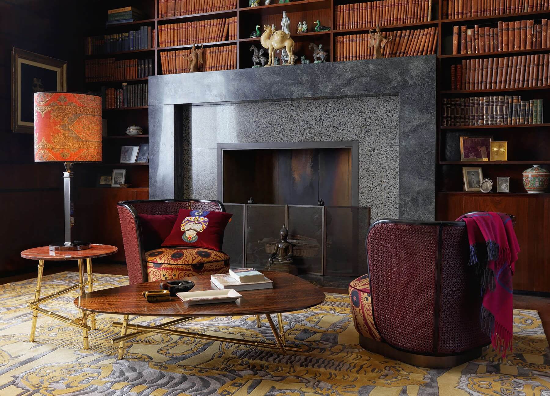
2. Don’t be afraid to experiment, add a pop of Living Coral colour through lamps, pillows, rugs and throws. Mix and match patterns and textures. Coral flowers with greenery also add vibrancy to the space with a fresh take on accessorising.

3. The beautiful rich Living Coral colour will mesmerise especially if there are elements of it on the wallpaper. Be bold and splash it across the walls for that added wow factor.


4. Although real coral can be more of a blood-red colour, Living Coral has a ‘hot’ pinkish-orange undertone. When looking at the psychology of colours, the orange, peach, salmon shades combines the energy of red and happiness of yellow along whilst boosting creative energies and promotes playful expression and optimism. Its pink undertones bring peace and calmness to any space; however the red touch enhance human metabolism and fuels the appetite – so use coral in the dining room to get guests feeling hungry!

5. By using Living Coral pillows on sofas and only upholstering the armchairs, chaise-longs, benches, pouf and stools in coral fabric in your living room; the coral tone won’t overtake the space yet keeps it on-trend.

6. In any sleeping area try to incorporate Living Coral in a subtle way. Remember is your space for rest so we look for calmness and peace. Try a patterned rug which includes different shades of coral, light armchair upholstered in coral fabric or simply the cushions or the throw.

7. Who said that working spaces and office should be boring? Add a pop on Living coral to it, remember that, according to the colour phycology and due to its red, yellow, orange and pink undertones, the Living coral helps to create happiness and optimistic energy, boots creativity yet brings peace and calmness to any space – and don’t forget that we spend an important time of our life in our workspace.


8.
If you want to incorporate the Living Coral but you rather keep it low key, you
can introduce the coral tone through home accessories and flowers.
This way you can splash with colour any space with candles and home fragrances,
and at the same time infuse any room with a lovely scent.
Pro tip: once your candle or home fragrance finishes you can use the container
as a vase!

9. How to best use Living Coral colour with other colours:
Coral and Grey: Brighten up dull grey by adding a splash of fun coral. Grey furniture emphasises bright coral walls, while brushed bronze metallic accents add crisp detail keeping a rich feel to the space.

Coral and Beige: Want a colour that really makes coral pop? Go for a neutral beige. Not only is this colour warm, but it evokes the colour of sand, so paired with coral it brings an element of beach chic to the space. Beige and cream are the perfect backdrop to coral drapes, pillows and furniture to keep the space fresh and cozy.


Coral and Blue: The complementary colour of orange shades is blue so move away from the neutrals and bring the sea into the home! The blue green hues add an element of serenity to the space. Add lamps, artworks, accent pillows, and curtains to keep the colours tranquil, just like the ocean.
References: Pantone and Architecture & Digest. Brands: Etro Home Interiors, Roche Bobois, Baobab Collection, Bene, Dr Vranjes Firenze, Camengo, Pierre Frey, Marburg.